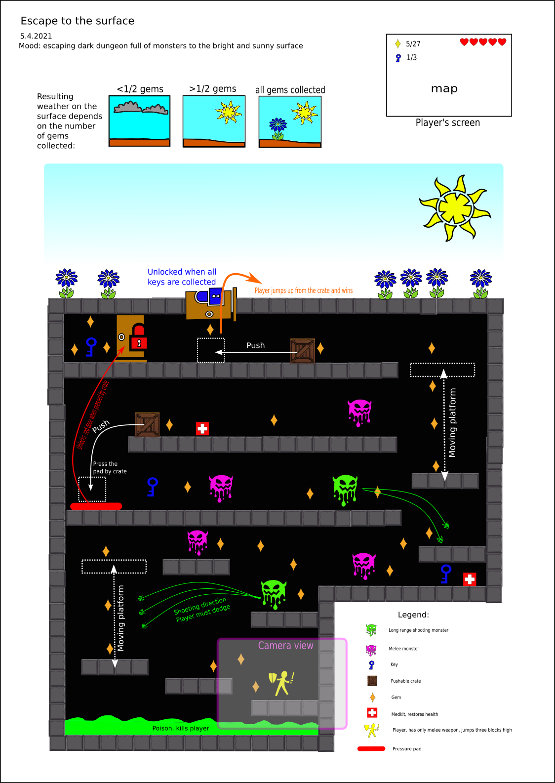
Week 4 - final One Page Design
5.4. - time spent 4 hours - remaking one page design into its final version
What changed since the last time:
After hearnig feedback on the one page designs, I decided to upgrade mine. I basically drew the entire design from the scratch, drastically changing the visual look to better, so now it doesn't look like bunch of basic shapes representing game objects. I used icons found on game-icons.net, which was suggested on the lecture and found it very useful, as one can edit the icons before importing them into inkscape. So now the design is much more eye catchy. I replaced hand written notes for computer written text, which enhanced readability, added legend to the icons stating what they mean, instead writing notes to the arrows pointing on the objects in the map. I overall reduced the number of the arrows in the design, as they made it look a bit confusing and messy. I also deleted some gems in the map as there were too many of them, so now the design overall looks much more neat and clear.
I also added camera view and info about how high can the player jump, so it's easier to imagine players movements.
Apart from graphical change the design itself didn't change much, the map is the same, in a few cases I moved some objects slightly.
Some thoughts on the design itself and why I did it like this
The fact, that we could use only objects from 2D game kit and our current knowledge of scripting is quite restraining to what we can create for this design. So my idea was to take 2D game kit and give it a little bit different story. 2D game kit's story is about collecting keys in different rooms, then unlocking main door and fight the boss monster afterwards. My idea was to build purely on the underground story, when the player is trapped deep in a dungeon full of monsters and desperately wants to go up to the surface where he can be free.
My one page design is quite linear, although sometimes player must return if they skip some platforms, to resolve puzzles and unlock doors. To help the player get oriented where to go, there is a bunch of gems on the path to collect, so it naturally leads the player to the correct way.
It's not hard to move around with the player (as in it's not hard to jump from platform to platform, moving platforms move in normal speed). The catch is that the game is combat oriented, there are quite a lot of monsters that can actually kill the player or make a lot of damage to him. This is intensified by the fact, that the player has only melee weapon, so he has to engage in close combat and cannot shoot the monsters from safe distance. On the other hand there are medkits to replenish players health after every three monsters.
There are tiny puzzles with crates in the scene, nothing too complicated, as it's not intended to be puzzle oriented game, but combat oriented, as mentioned above. The puzzles are there mostly to make the game more diverse.
There is also this tiny feature, that the game remembers, how many gems you collect underground and according to that it changes the weather on the surface. The idea was that the more player tries to finish completely the level (collecting more gems), the more he is revarded by good weather, when he finally reaches the surface. But it is just small touch to the game, it doesn't affect the fact, that the player wins upon reaching the surface.
To open the design, either open .svg in inkscape (browser renders it weirdly for some reason) or check out the .png version

Files
Get Project A
Project A
| Status | Prototype |
| Author | SharpFoxDev |
| Genre | Platformer |
| Tags | mff-gdintro-2021-a |
More posts
- Week 3 - revisiting one page game designMar 28, 2021
- Week 3 - scripting and Orb MazeMar 28, 2021
- Week 2 - One Page Design - GameDev journal entry 24.3.2021Mar 24, 2021
- Week 2 GameDev journal entry 22.3.2021Mar 22, 2021
- Week 1 GameDev journal entry - 11.3.2021Mar 11, 2021
Leave a comment
Log in with itch.io to leave a comment.